Introduction
Elliott Chorn: Welcome to How to Forecast the Next Record-Breaking Demand Spike with Amperon's Mid-Term Forecast. I'm Elliott Chorn — I run markets and customer here at Amperon. With me today are Arianna Goldstein, one of our senior solutions consultants, and Karin Gerbi, who runs product. They're going to do the work today; I'm just going to ask the questions.
We're going to take one storm — Winter Storm Fern, the last week of January — and walk the whole thing end to end: what the weather did, what demand did, what the grid operators expected, what we said and when we said it, and what all of that was worth if you were the one trading it.
Looking at one storm in this much detail is a deliberate choice. There are plenty of decks out there with a wall of accuracy stats. Everybody's seen one. I've never met anyone who put on a trade because of one. What I want you to leave with is how the signal actually shows up — how early, how noisy, what it looks like on the days it works and the days it doesn't.
There are things here that didn't work, and we'll address those too.
The presentation has six sections, in the order that the information showed at the time:
- What happened — the storm, the load, and the number that got reported wrong almost everywhere.
- The 15- to 45-day window — where the event was visible but the market didn't see it. This is the section I care about most.
- Mid-Term Forecast replay — what our forecast actually said, run by run, with the date attached.
- Short-Term Forecast replay — the same, coming into the peak.
- How the two products fit together — the commercial argument.
- Takeaways, including a few things we can't claim yet — and I'll be specific about which ones.
None of what follows is reconstructed after the fact. These are the numbers as we published them at the time, wrong calls included. With that, let's get started.
What Happened During Winter Storm Fern
Elliott: Arianna, take us back to the week before anybody was calling it Fern. What were you watching as things came together?
Arianna: Reflecting on that week — from Friday, January 16th to Monday the 19th — the models changed an extreme amount. Traders left the office on Friday not worried and came back Monday morning to a winter storm in the forecast that would soon be named Winter Storm Fern.
This is a pattern I saw a lot this past winter: the weather models weren't really picking up the intensity of these storms until less than a week out. By the time the storm had a name, it was already too late to do anything about it.
Fern got named on January 21st, and the curve started moving on the 20th. So the public weather story and the repricing happened within 48 hours of each other — and by then you're buying power at $315 instead of $37.
Our midterm forecast had this day flagged starting December 18th — five weeks earlier. To be clear, nobody was looking for a storm in December, because there wasn't one yet. It was a pattern showing up in the extended ensemble model. That model's job is to resolve the pattern that far out; our job is to turn it into megawatts on a specific delivery day. By the time the storm is named and on the weather map, everyone has it, and the money's gone.
Elliott: If I can just watch that forecast myself, what do I need a mid-term view for?
Arianna: A mid-term view lets you hedge farther in advance. On December 18th, our model was showing a pattern suggesting an event could happen that week. ERCOT futures were trading $37 to $50 for weeks after that. You could buy that power ahead of time and capture the profit in real time. That's what the midterm view gives you.
Elliott: So what actually happened during Fern? Walk us through the bars — what's a normal late-January day, and why are these four highlighted?
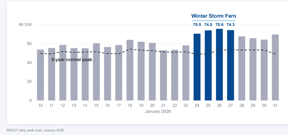
Arianna: The dashed line is the five-year normal — the average of the past five years for that specific day in January. The gray bars are the actual peak loads for other days this past winter. The blue bars are the peak loads during Winter Storm Fern — almost 50% higher than the five-year normal (most of January ran above normal, too).
Saturday started strong with a 70-gigawatt peak, and we hit the highest peak on Monday morning at 75.6 gigawatts, at 9 a.m. — the single highest hour ERCOT saw all winter, with the three highest hours bordering it.
Elliott: Was that a record for ERCOT — a winter record, or an all-time record?
Arianna: It wasn't a record. The winter peak record is 80.5 gigawatts, set in February of last year. It was a big winter day, but not the biggest. The bigger surprise — which we'll get into — is that demand actually came in nine gigawatts under what the grid operator was expecting.
Elliott: The headline was that demand exploded, and there was even talk of blackouts. What actually happened?
Arianna: We peaked at 75.6 gigawatts. ERCOT isn't a winter-peaking ISO yet, but the winter record is in the 80s. That Monday morning, demand exploded, but not as much as ERCOT expected — their forecast was 84.6 gigawatts, nine gigawatts higher than what actually happened. Amperon's forecast fell in between the two.
What drove the downside: a lot of power outages, a lot of people out of school (one to two million students — most major Texas school districts closed for a week), people snowed in, and curtailments at data centers. All the demand that usually shows up on a Monday morning didn't happen.
Elliott: Can you dig into the root causes of a gap that large?
Arianna: With a million students out of school, the buildings are closed — HVAC systems off, lighting off, kitchens off. Office buildings were empty because people were snowed in or under work-from-home mandates. Smart thermostat programs were offline because of outages, and data centers were curtailing. That's what drove the nine-gigawatt difference. It's largely a human behavior story.
Elliott: What are we looking at in this next chart?
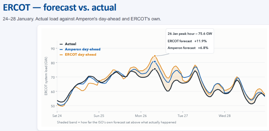
Arianna: The black line is the load curve that actually occurred Monday morning. The orange line is ERCOT's day-ahead forecast — the 84.6-gigawatt peak. The blue line is Amperon's day-ahead forecast. Except for Saturday, ERCOT over-forecast demand fairly consistently on Sunday, Monday, and Tuesday, and under-forecast on Saturday — likely a weather miss or the cold arriving a little early.
ERCOT was conservative throughout the storm, and we understand why: their job is to keep the lights on. A trader's job is to get the price point right. Either direction is wrong, but an under-forecast bias has much larger consequences for a grid operator than an over-forecast — being short on power during an ice storm is far worse than having generation online that isn't needed.
Elliott: The forecast bands are tight on Saturday but widen out by Monday morning. What's happening there?
Arianna: ERCOT gets more conservative as everyone goes to work and kids go to school, and generators cycled off over the weekend ramp back up — that's the shift from weekend load pattern to weekday load pattern. ERCOT was being very conservative to make sure the lights stayed on during an extreme winter storm. Texas doesn't see storms like this often, and when it does, it causes real disruption — it's not a winterized grid.
Elliott: ERCOT's forecast is a free public service. On a normal Tuesday with nothing happening, does the accuracy gap even matter?
Arianna: It always matters. Looking at the nine quiet days before the storm, our average MAPE was 1.57% versus ERCOT's 2.7%. During the storm itself, our MAPE rose to about 3.7% versus ERCOT's 4.5%. So proportionally the gap widens on extreme days versus ordinary ones — but accuracy matters everywhere. Extreme events are hard for everyone; that week broke the usual temperature-to-load relationship, for us and for ERCOT alike.
Everyday accuracy is where a model's quality actually shows up, because nothing chaotic is happening — it's just whether you've got the relationship right. You don't use these forecasts only for the four extreme events a year — you use them every day, and that's what pays off when the extreme days come.
Elliott: Zooming out to PJM — across the storm, in every market we cover, where did we do well, and where did we do poorly?
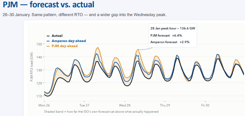
Arianna: It's a similar-looking chart to ERCOT: orange is PJM's day-ahead forecast, blue is Amperon's, black is actual load. PJM was also conservative with its demand forecast, for the same reason — keeping the lights on during a major winter storm — though for somewhat different underlying causes.
PJM saw school and office closures, work-from-home mandates, and data center curtailments. Specifically, PJM activated a pre-emergency demand response Sunday afternoon in a handful of regions that include "data center alley." On Tuesday, PJM declared a Level 1 emergency, with about 21 gigawatts of generation — roughly 15–16% of their fleet — forced offline due to freezing conditions and gas supply shortages. Similar pattern to ERCOT, different specific drivers.
The 15-to-45-Day Window
Elliott: Karin, this is probably the slide I want everyone to remember most. Walk us through it.
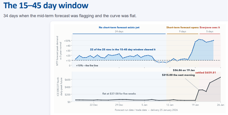
Karin: We have two horizontal panels sharing the same calendar. On top is our forecast for January 25th, run by run, against the five-year normal (the dotted line). On the bottom is what that day's contract was trading at on the same date.
There are three vertical bands:
- Blue (December 17th–January 11th, a 24-day stretch): No short-term forecast exists yet for the 25th — it doesn't go out that far. Our runs sit above the five-year normal for most of this stretch, while price sits at $37, briefly touching $58. It's not moving.
- Middle band (January 11th–19th): A short-term forecast now exists — we're in the two-week window — but the weather hasn't resolved yet, and price is still at $37.
- Red band (five days out): Everyone sees it coming. We're at $37 on Monday. By Tuesday it's $315, and it settles at $660.
So the window where you could act on this without paying for it was about five weeks long, and for the entire time it was open, the price was telling you nothing was coming.
Elliott: What is the model looking at back in December to make that call for the 25th?
Karin: It runs on the ECMWF extended ensemble, which goes out about 45 days. The ensemble matters — it's not one forecast, it's many versions of how the atmosphere could evolve. What comes out isn't a single number either. For every hour of every day across those 45 days, we publish a full distribution, from the 5th to the 95th percentile — a range and a shape, not a point estimate, and that's the part people underuse.
The width of that band tells you how much the number still has to move. When the band is wide two weeks out, the forecast tends to shift about twice as far before delivery as when the band is tight. A wide band is the model telling you it isn't done yet.
Elliott: Let's talk about the 10% "firing" threshold — what does that mean?
Karin: It's a simple rule: if the median forecast is more than 10% above the five-year normal, we say the forecast is "firing." No tuning, no market-specific adjustments, no discretion. "Normal" is the 2020–2024 average for that same calendar day and hour — for January 25th, we compare against the previous five January 25ths, not a monthly average — and we deliberately exclude the event year itself so the storm doesn't leak into its own baseline.
Ten percent is intentionally simple, a round threshold chosen upfront. If it fires once, you watch it. If it keeps firing, that's your signal to act. What gives us conviction isn't how high the forecast gets — it's whether the signal persists across runs.
Elliott: Why not tune that threshold to get a better number?
Karin: A tuned number tells you about last winter. What you need is something that holds up on a season you've never seen. Anyone can fit a threshold to data they already have and make the chart look better — but from the outside, you can't tell the difference between a model that works and one that's been fitted to the answer.
The more practical reason: an untuned rule is one you can check yourself. Take our median, take the five-year normal, draw the line — you don't need us to reproduce it. If it works on your book, you'll know in six weeks; if it doesn't, you'll know that too.
Elliott: Walk us through this next view — the sustained-signal pattern.
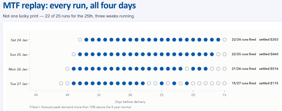
Karin: Four rows of dots, one row per delivery day. Each dot is a published run, reading from 45 days out on the left to 15 days out on the right. Filled means more than 10% above normal (fired); hollow means it didn't. You want a row that's mostly filled — that's the call holding.
For January 25th, we started firing around 38 days out and kept going — 22 of 25 runs fired. This is a dot chart rather than a line chart specifically so you can count it; it's not a smoothed average, it's every run we published, misses included.
Elliott: What about the hollow dots — every row has a few. Is that signal?
Karin: Yes. For the 25th, we missed three times — around December 17th, and two near the end. But look at the 27th: 15 of 27 fired, the weakest of the four days by a fair margin. That was the tail of the event, as the cold was breaking — pinning the last day of a cold snap from four weeks out is harder than pinning the middle of it, and that showed up in the results. It was also the mildest of the four days, settling at $115 against the higher-priced days. So the day we were least sure about was also the day that mattered least. That's not always how it goes, but that's how it went here.
Elliott: Could a desk build this 15-to-45-day signal themselves? What are people typically using in this window today?
Karin: That's a question we get all the time. The default is a long-run average for that calendar day — take the last five or ten years and use what January 25th usually does. That's not a foolish approach; it's what any of us would do with no better option. Your short-term model has nothing to say about a specific day two weeks out, so you fall back on the historical normal.
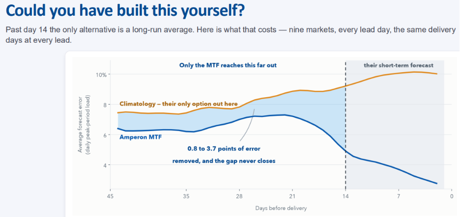
Our comparison here is Amperon's forecast against that same fallback — not against a competitor — across nine markets, and this analysis excludes Fern dates; it's looking at the month after.
Elliott: That's roughly a one-to-three percentage point improvement. What's that worth in actual megawatts?
Karin: It depends on the market. In PJM, that could mean two gigawatts on an average day. In ERCOT, it could mean 700 megawatts. It's market-specific, and this is on ordinary days — this window's numbers deliberately exclude the storm itself.
Mid-Term and Short-Term Forecast Replay
Elliott: Moving into the short-term forecast window — what's the difference between the two products?
Arianna: We benchmark against the ISO's forecast for two reasons. First, it's a number everyone in the room can already see. If we benchmarked against a competitor, you'd have to trust us — I'd pick the competitor, the window, and the comparison. The ISO's forecast is published; you can pull it yourself and check whether what I'm telling you is true. Second, a lot of desks already use the ISO forecast as their benchmark — it's what gets quoted in morning meetings. We're not trying to academically beat a number; it's the number your business is already anchored to.
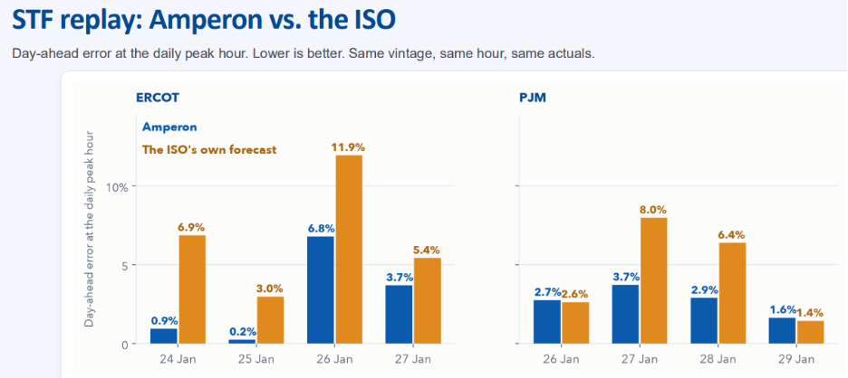
Elliott: Looking at the eight peak hours — what happens if we widen that window?
Arianna: Widening it shows more uncertainty; tightening shows less. Across the eight peak hours on event days, we win six of them. The two we lose, we lose by about a tenth of a point. Widen the window day by day and the count moves closer to even — the wider window's average error is where that shows up.
Elliott: Why does the ISO's load forecast matter so much?
Arianna: Because that's what the market anchors on going into the day-ahead. The ISO publishes tomorrow's load forecast, generators bid against it, buyers position against it, and the day-ahead clears on the back of that. If the published number is high, the market has prepared for a bigger day than the one that shows up, and real-time arrives short of that demand — supply is lined up for demand that never appeared. On January 26th, that gap in ERCOT was nine gigawatts that never materialized.
Forecast accuracy isn't valuable because you win an accuracy contest — it's valuable because it changes the decision you can make.
Elliott: Do we have a sense of where the dollars moved on this?
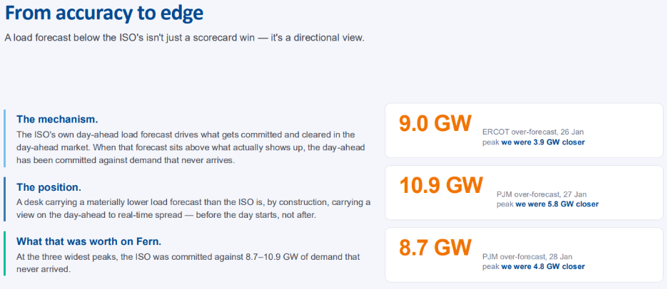
Arianna: Nine gigawatts is not an insignificant number — it leaves the market long, and the day-ahead/real-time spread blows out. At $416 a megawatt-hour, 100 megawatts across 16 peak hours works out to roughly $665,000. This isn't an edge you harvest repeatedly — it's what one day of being nine gigawatts closer than the market was worth, in a week when that happened to matter a lot.
How Short-Term and Mid-Term Forecasting Fit Together
Elliott: Walk me through how I'd actually use these two forecasts day to day.
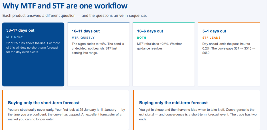
Karin: From five weeks out to about two weeks out, you only have the mid-term forecast — there's no short-term number for the 25th yet, because it doesn't go out that far. The mid-term forecast is telling you: pay attention, something abnormal is coming, and you're seeing it while the market is still cheap.
Then two things happen that look similar but aren't quite the same:
- 16 to 11 days out: the mid-term signal fades to about 6% — it's not firing anymore — while the short-term forecast is only just coming into range.
- 10 to 6 days out: the mid-term rebuilds to 25% as weather guidance starts resolving.
- Inside 5 days: the short-term forecast lands, peak-hour error tightens to about two-tenths of a percent, and that's when the curve actually moves — from $37 to $315 to $660.
If you only have a short-term forecast, you're structurally late — you get a clear view of something the market may have already priced in. That's why you bring the two together: the mid-term forecast gives you the early signal, and the short-term forecast gives you the conviction and the exit. Together, they give you both ends of the trade.
Takeaways
Elliott:
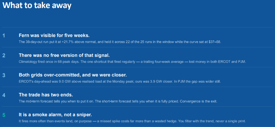
- Firm signal, visible for five weeks. We flagged Fern on December 18th; it held for 22 of 25 runs, all while the contract sat between $37 and $58.
- No free version of this signal exists. Climatology fired once in 68 days — and following it would have lost money in both PJM and ERCOT.
- Both grids overcommitted during Fern, and we were closer. ERCOT was nine gigawatts high; we were four.
- The trade has two ends: the mid-term forecast to put it on, the short-term forecast to know when it's priced.
- It's a smoke alarm, not a sniper. It fires more often than events actually land, and that's by design.
What we're not claiming: this is one storm. That's the honest limit of everything shown today — for an unglamorous reason, not a flattering one. This analysis is built on our actual published archive, which starts December 17, 2025. Anything earlier would have required a backtest — simulated weather producing a number we don't consider valid.
One detail worth noting: on December 18th — the second day of the archive — we flagged January 25th. We don't know how much earlier that signal actually appeared, because the archive itself only starts on the 17th. You don't have to take this on faith — you can pull the model from early December yourself and see how it played out.
Q&A
Q: What markets are you covering with this?
Karin: All markets across the lower 48 and Europe, at a zonal level — not just system-level. We're also working on adding renewables (solar and wind), which is coming soon, so we'll eventually have a view of net demand rather than just demand.
Q: Why wouldn't someone just buy the ECMWF ensemble and build this themselves?
Arianna: Short answer — we do the dirty work. It's 50 different ensemble members, each a distinct weather forecast, going out seven months when you combine the sub-seasonal and seasonal windows. We combine those, then convert them into a demand forecast. Doing that yourself as a trader would take a lot of time; we do it for you so you can spend that time on analysis and your own adjustments instead. We also take it further into a full probabilistic forecast — P5 to P95, with P10-to-P90 intervals.
Q: As you got inside the 15-day window and the dots started going hollow, was there a lull before the short-term forecast picked it up? What caused that, meteorologically?
Arianna: It's uncertainty in the models — as you get closer, new signal comes in and the spread can widen briefly. I wouldn't take my eye off it at that point; that's when you start leaning on the short-term forecast and watching whether the earlier signal is converging as more weather data comes in.
Q: Have you compared your forecast to Google Weather Next?
Karin: Yes — we're actively bringing that data in and running tests. Their models are improving rapidly, and we're able to give them feedback on how their weather forecasts translate into energy, solar, and wind forecasting. Right now the signal is mixed — some of their forecasts perform better in certain ranges than others — but we've seen particularly good early results in the 7-to-10-day window. We're already partnered with them to get access to the latest data as it becomes available.
Q: The mid-term forecast flagged a future event that weather forecasters weren't calling yet. How was it able to do that?
Arianna: ECMWF builds a control forecast for that 45-day sub-seasonal window using the atmosphere's initial conditions — sea surface temperatures and other data that capture ongoing oscillations, like the strong El Niño we were in. That pattern shows up in their control run, and they generate 50 additional perturbations around it to build the full ensemble. We take that pattern and convert it into a demand curve.
A human weather forecaster could, in principle, spot the same pattern, but it would take a lot of pattern recognition and years of experience with similar historical setups — and this particular El Niño was unusually strong, essentially a new pattern we haven't seen before, similar to a lot of what we've observed in recent weather events.
Q: Can you go into the technical details of how weather data gets translated into load data?
Karin: We're intentionally weather-vendor agnostic — at this point we bring in more than a dozen weather vendors, some short-term, some longer-range, and typically 15 to 25 different weather variables per vendor. Our data science team spends significant time determining which variables matter most depending on whether we're forecasting demand, solar, or wind, and which region we're in, along with how different vendors have historically performed.
We weight variables and specific weather points, and we use population-weighted density for demand forecasting so we capture demand pockets accurately rather than relying only on airport weather stations. We're bringing in weather data from what's now approaching six figures in weather points globally.

.svg)







































%20(3).png)
%20(2).png)
%20(1).png)





.png)


.avif)



.avif)
.avif)

.avif)
.avif)
%20(15).avif)
.avif)


.avif)

.avif)
.avif)